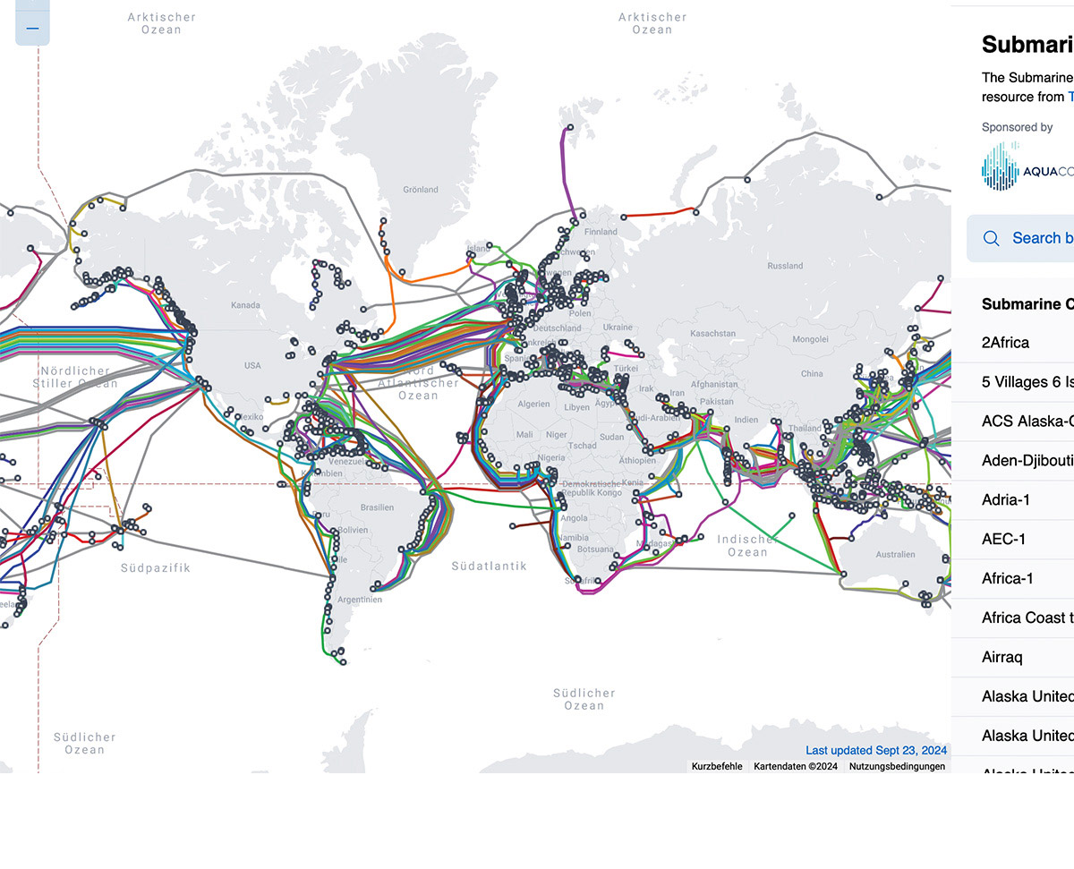
Layering telegraphy and internet infrastructures through the centuries

This page shows two overlapping maps. One map shows the 'All Red Line' from 1901: All telegraph cables that the British used to connect to colonized lands. The other map layered atop shows all known internet submarine cables from 2024. These cables carry 99% of internet traffic. Move the slider to find out: Where do these maps overlap? Where do they differ? And why are the internet's landing stations still positioned predominantly above the equator?

This interactive image shows a telegraph map from 1901. The world map looks like it has been drawn with a pencil atop light blue oceans. The names of places, landscapes and oceans are written in capital letters on top. In the middle of the map is Europe, and from Britain, many red cables emerge that span across the map and connect to the other continents. Underneath of this image, there is a slider element. When moving this slider, another image is layered atop this map. This other image is a representation of all current submarine cables on a world map. The cables are colorful, and all landing stations are represented by little dots. Both images resemble one another when it comes to the positions of the cables. Moving the slider back and forth and thus changing the transparency of the modern map atop makes this more apparent.